SitSwap is a mobile app and responsive website that will be the leading online solution for busy parents to gather as a community and trade childcare/babysitter hours with trusted neighbors.
Streamlining P2P Childcare Coordination
Currently there is no leading online solution for busy parents to gather as a community and trade childcare/babysitter hours with trusted neighbors. The goal is to develop a mobile app and responsive website that will deliver a clean user interface and a seamless, enjoyable user experience that will build trust and a sense of community in users.
- User research provided an understanding of what users wanted and a road map of how to solve their problems
- Prototypes testing with usability studies
- Refined mobile app design
I couldn’t be happier with how the UX for SitSwap turned out. Steve took me and my partners through the entire process, from user research, wireframing, prototype testing, and endless iterations, with so much care and attention to detail. He caught so many tiny friction points and confusing phrasing choices during the usability studies that would have completely tripped up our users in production. He was collaborative, deeply empathetic to our audience, and delivered a polished high-fidelity prototype that feels safe, accessible, and ready for the community. I’d jump at the chance to work with him again!

In a world in which you are constantly busy, working parent, and cost of living seems to be skyrocketing, people need an affordable childcare option that they can trust. The goal was to design and develop a mobile app and responsive website that delivers a clean user interface and smooth user experience in which busy parents can congregate online as a community to offer trusted childcare support for one another. The biggest challenge was unearthed in research, which ultimately informed me that the primary concern for parents was being able to trust the person that would provide care for their children. By conducting thorough user research, building prototypes, running usability studies, and refining my designs based on findings, I can deliver an optimized user experience.
We conducted qualitative user research through interviews, persona development, and the creation of user stories and user journey maps to understand how different users find and use childcare online. Our research reveals that while SitSwap was conceived to alleviate childcare costs, users actually prioritize psychological safety and logistical reliability over financial savings. The “Trust Gap” emerged as a universal pain point, with parents demanding rigorous vetting and shared parenting philosophies (e.g., “Philosophy Tags”) rather than a high volume of strangers. To succeed, the platform must pivot from a broad marketplace to a “Trust-First” architecture—implementing hyper-local “Trust Circles,” automated calendar matching to reduce the mental load of scheduling, and an accessibility-first “List View” to ensure inclusivity for all tech fluencies and physical abilities.
Our user research was distilled into 4 major pain points of users: the “Trust Gap”, “Scheduling Tetris”, the “Ghosting” Effect, and interface overload
All of the users during the user research expressed that the trust variable was a top pain point
Based on the findings from user research, I sketched out the initial paper wireframes with the intent to address user pain points. My priority of the UI was to maximize efficiency via intuitive placement of vital menu items and actions as well as piggybacking on existing social media UI conventions.
The initial designs needed a way to address such issues as:
- Providing a way to increase trust in the platform – maybe with integrated social media widgets that highlight common friends; or official verification checkmarks
- Mental load of calendar scheduling and syncing – via preference settings to attach user calendars (including iCalendar, Outlook, Google, etc.) and app functions to automate adding confirmed events to associated calendars
- Interface overload – through allowing different viewing options of search (like list-view, map-view, etc.)
6 quick paper wireframe sketches were created to draw upon the best ideas
12 different page screens were created in digital low-fidelity in Figma
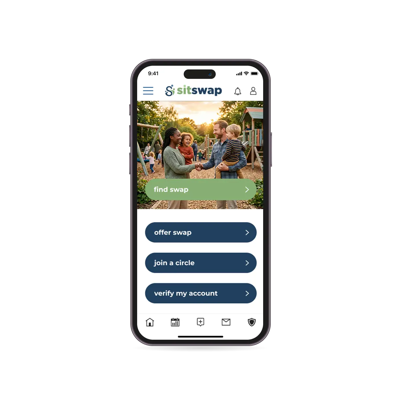
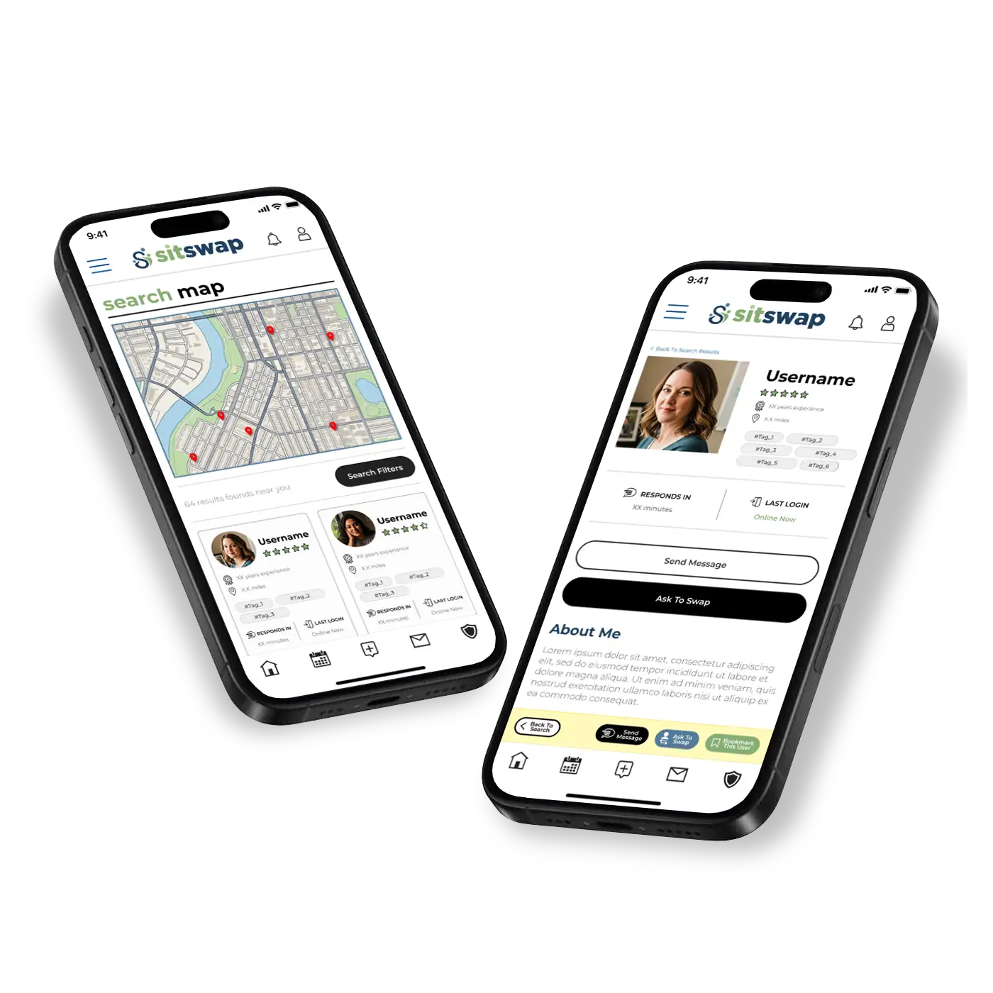
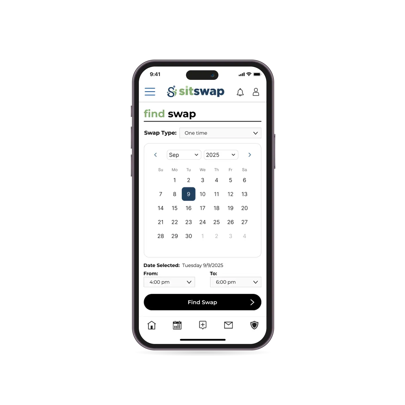
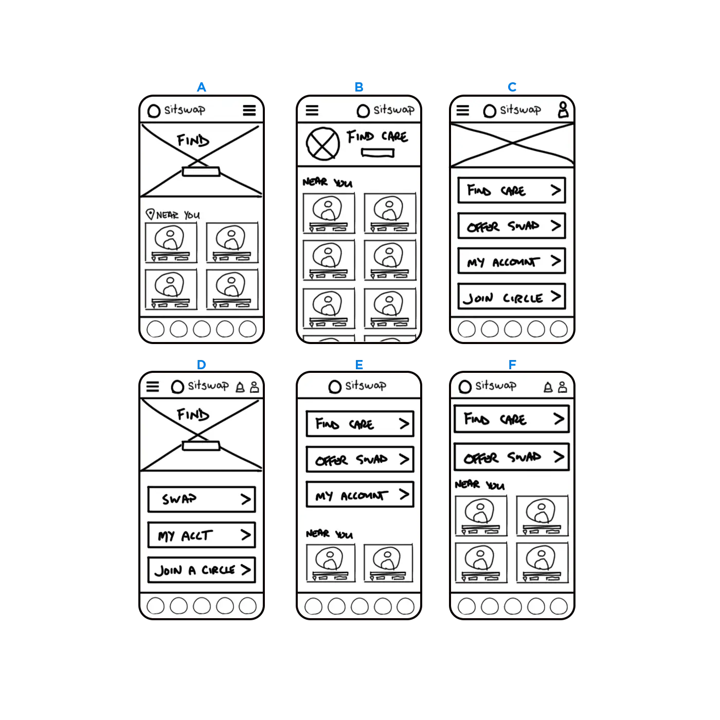
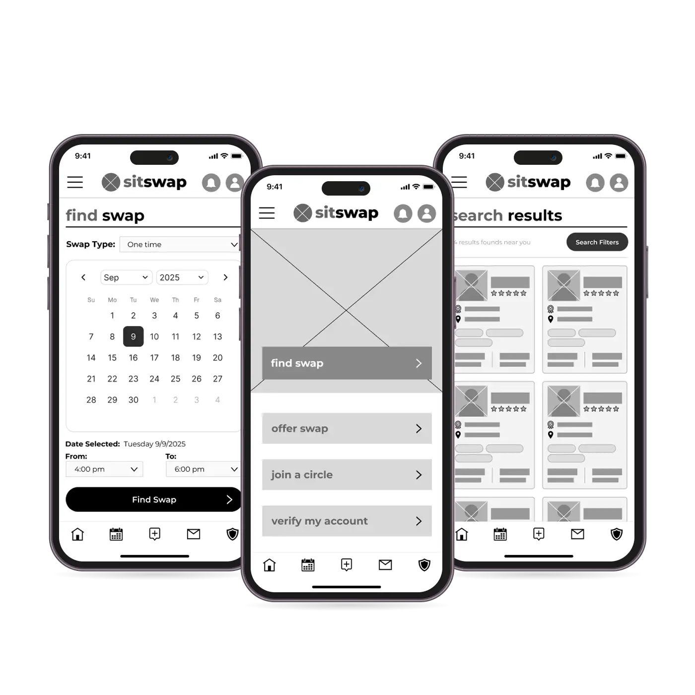
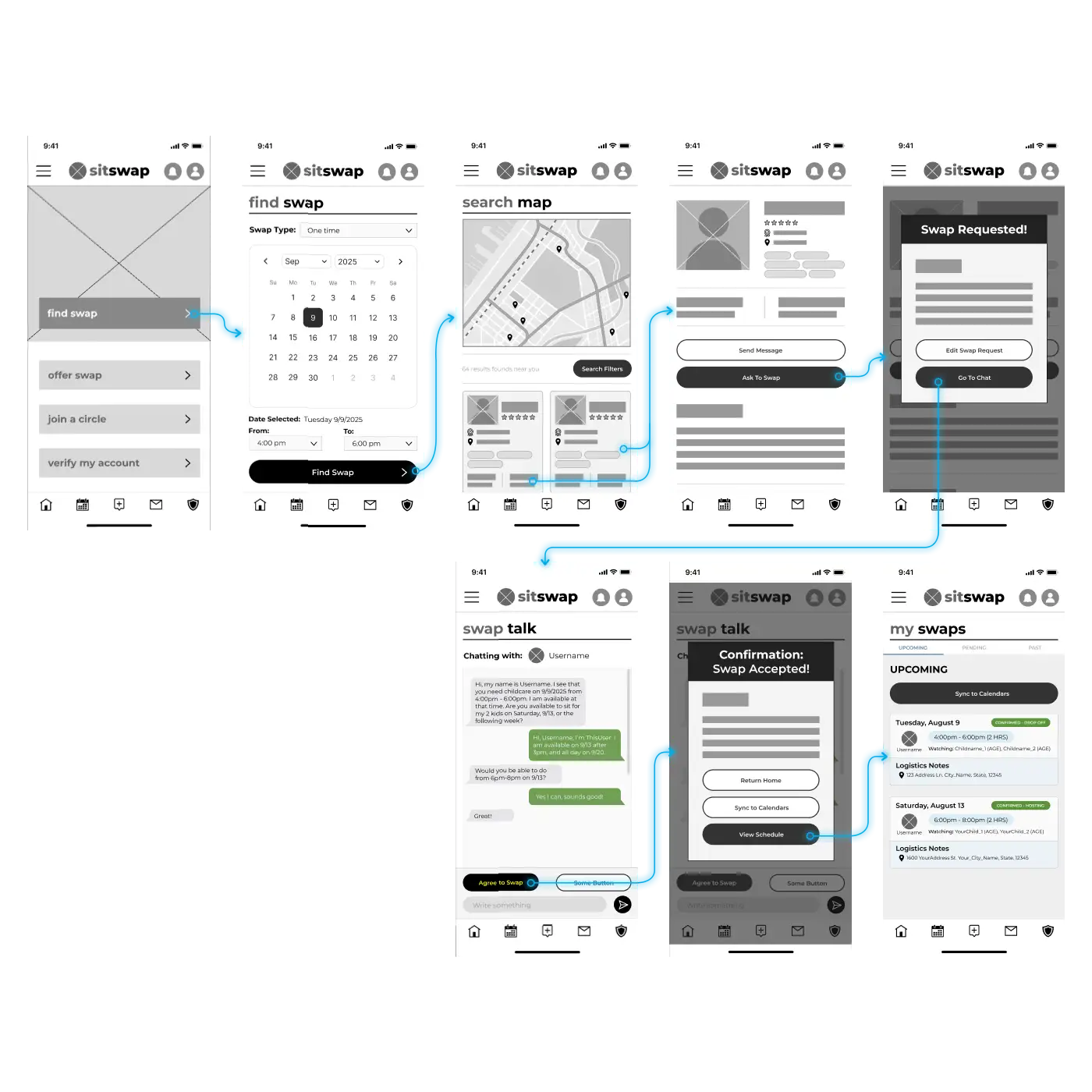
In order to understand how well the app works for real users, I planned and ran a usability study to test if the core user experience, browsing for childcare swap partners, selecting one, and agreeing to a swap arrangement, was easy for users to complete. The study was designed as an unmoderated user study in which users were asked to perform tasks with the low-fidelity prototype on Figma. The task list was comprised of 4 prompts of a basic user path in which the user would start from the Home screen, search for childcare swap partners, select a suitable partner, and then form an agreement to an arranged swap. For each prompt, participants would document their click path as well as list any behaviors, opinions, and attitudes along with any errors, issues, or areas of confusion experienced. All of the data collected from the study participants was distilled into patterns and themes, which was then converted into actionable insights for prototype refinement.
Wanted larger touch targets for actions
3 out of 5 study participants wanted clearer scheduling terminology and softer action terminology
60% of users expressed a desire to have a more expedient path to searching for swap partners from the Home screen
Some of the study participants expressed that they would like to have the option to view Swap partner search results in a list-view rather than map-view
The actionable insights derived from the usability study provided me with a list of items to address or improve for the next iteration of the prototype. One of the more commonly addressed issue by usability study participants was that the language used was a slight deterrent to encouraging action on the users’ part. In order to maintain consistency, “care” was changed to “swap”, and the “My Swaps” and “My Calendar” were consolidated into “Schedule”. Another one of the issues brought up by participants of the usability study was that the modal confirmation windows had a z-index below the header and footer and needed to be increased to the top z-index level to implement focus trapping. Also, for user convenience, I added a button to quickly sync the event to all calendars connected to the app.
Completing the UX design project for SitSwap reinforced that designing for high-stakes community coordination requires a delicate balance between strict utility and psychological comfort. I learned that establishing trust in a peer-to-peer, non-monetary ecosystem hinges entirely on intentional microcopy and seamless accessibility; shifting from rigid, transactional language to softer, community-driven interactions radically reduced user anxiety during scheduling. Furthermore, designing for busy, multi-tasking parents highlighted the vital importance of progressive disclosure and inclusive design frameworks, proving that an interface must be as resilient and adaptable as the families it serves. Ultimately, this project taught me that a digital platform can successfully replicate a physical “neighborhood handshake” only when the UX architecture prioritizes human connection and universal accessibility above all else.