ReCherished is an online marketplace solution for buying and selling of used children’s clothing, featured a mobile app and a responsive website.
A Used Children's Clothing Marketplace App
Currently there is no leading online marketplace solution for busy parents to gather as a community and buy and sell used children’s clothing in an intuitive and convenient manner. The goal is to develop a mobile app that will deliver a clean user interface and a seamless, enjoyable user experience that will build trust and a sense of community in users.
- Mobile app design
- Responsive website design to accompany app
- Smooth user experience reinforced by usability studies
Working with Steve was a complete game-changer. When we started, we had a complex vision for a circular marketplace, but no clear path to making it user-friendly for busy parents. The design process was incredibly thorough — seeing our ideas evolve from rough paper sketches into a sophisticated, high-fidelity prototype was seamless. He didn’t just ‘design screens’, he deeply understood our users’ pain points through rigorous research and usability testing. The final result is intuitive, beautiful, and perfectly aligned with our brand mission. We couldn’t be happier with the outcome; it’s truly a perfect fit!

The project was conceived as an online marketplace community for busy parents to gather and buy and sell user children’s clothing. Currently, there is no dedicated app or service that caters to the needs of parents on the go whom are trying to provide for the needs of their family in terms of clothing. The goal is to develop a mobile app and responsive website that will deliver a clean user interface and a seamless, enjoyable user experience that will foster trust and a sense of community within the users by conducting thorough user research, building prototypes, running usability studies, and refining my designs based on findings.
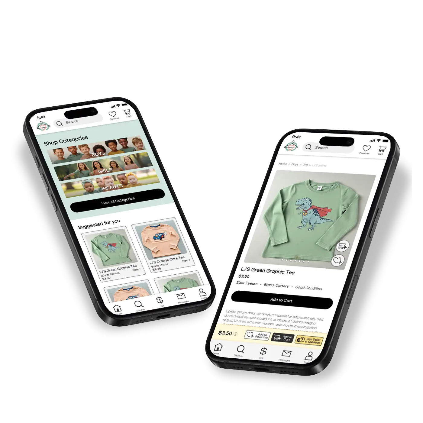
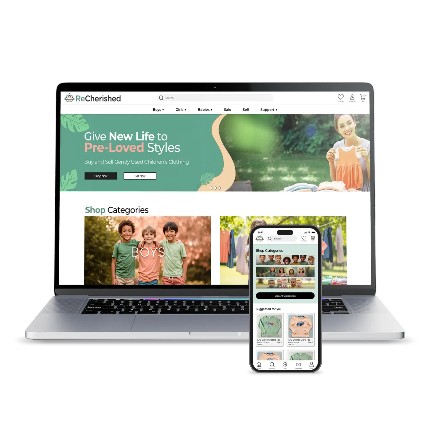
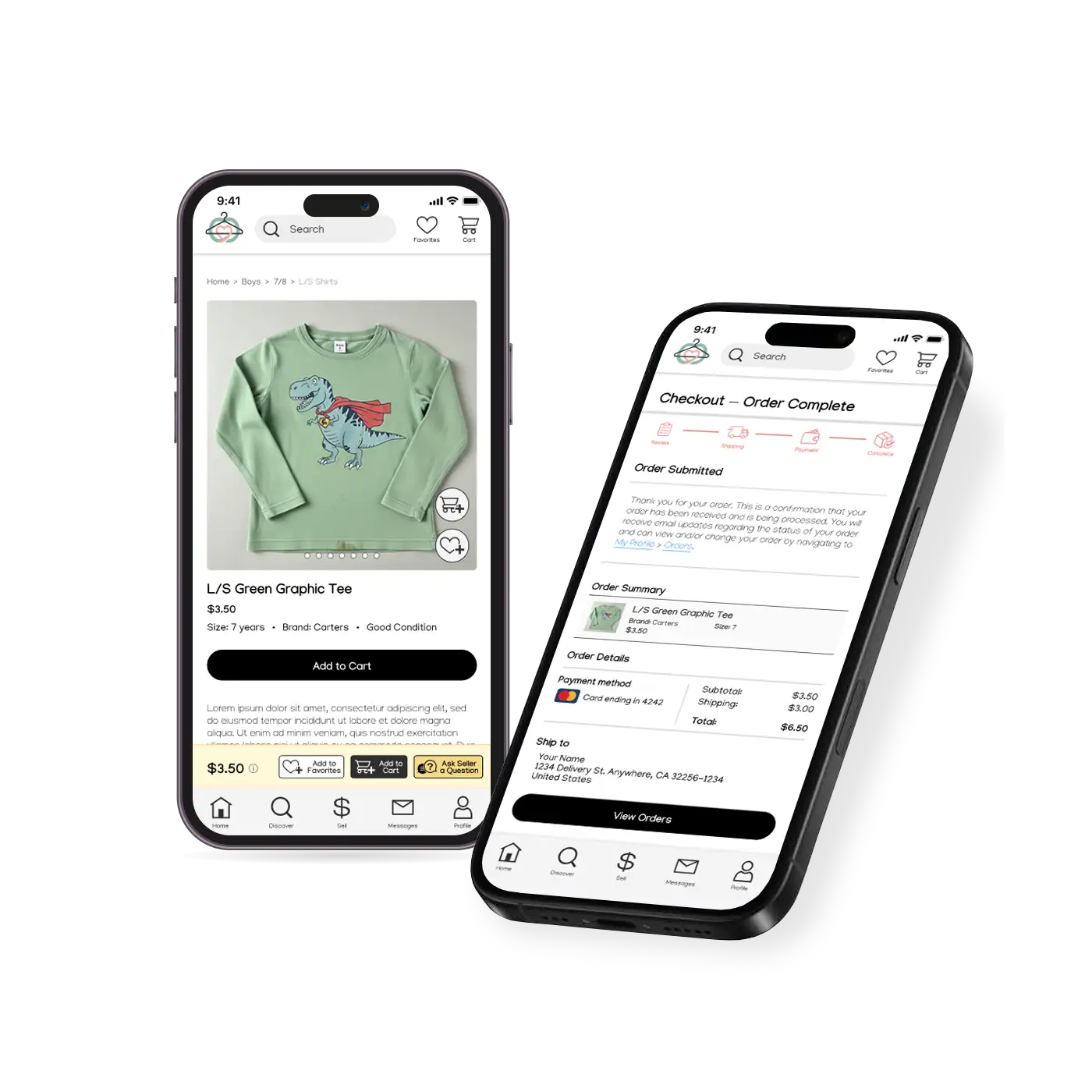
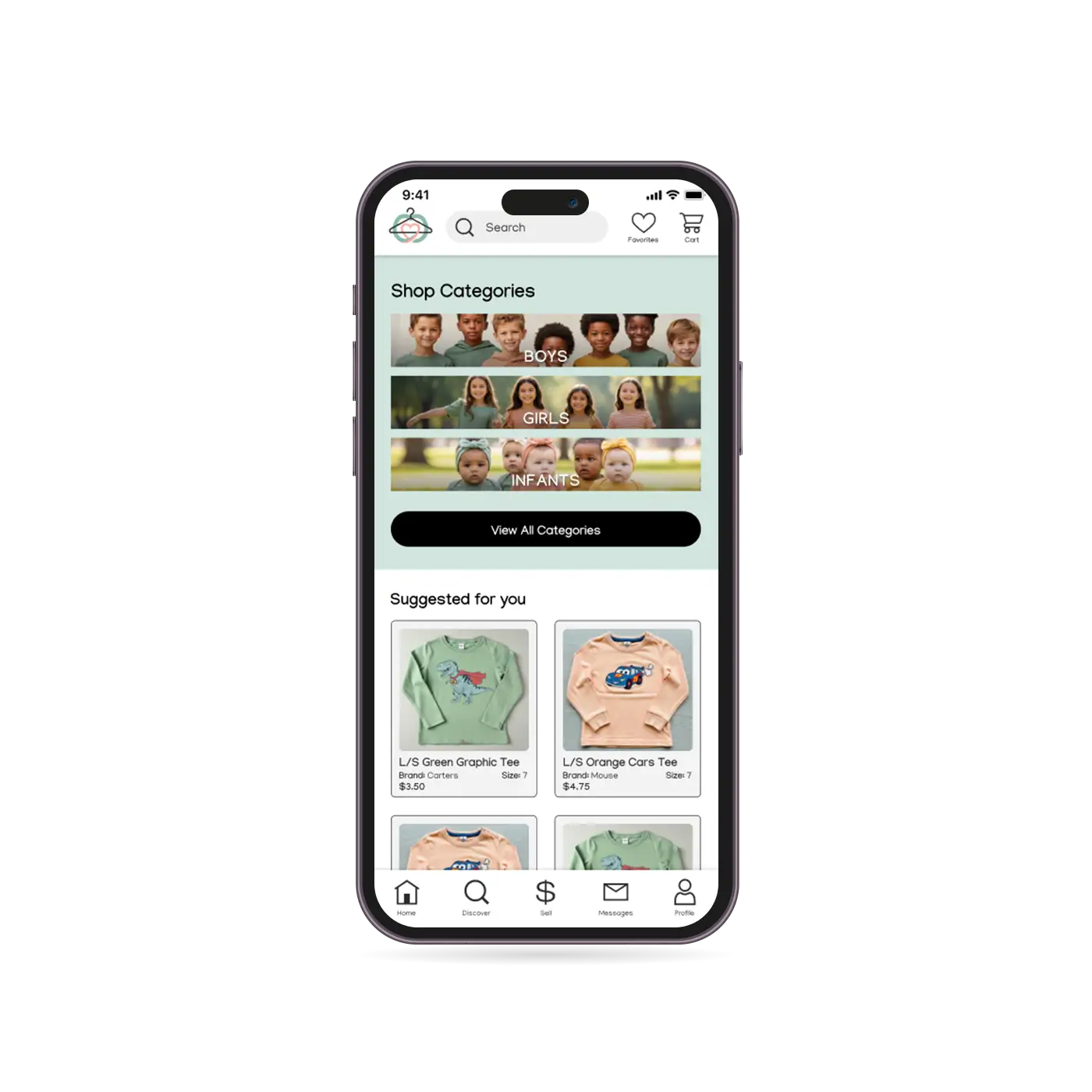
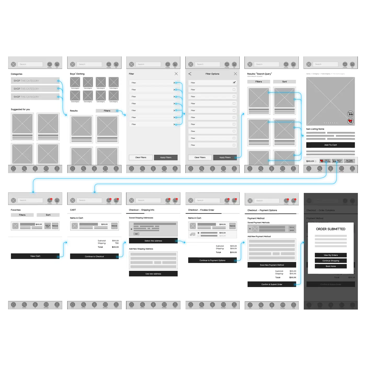
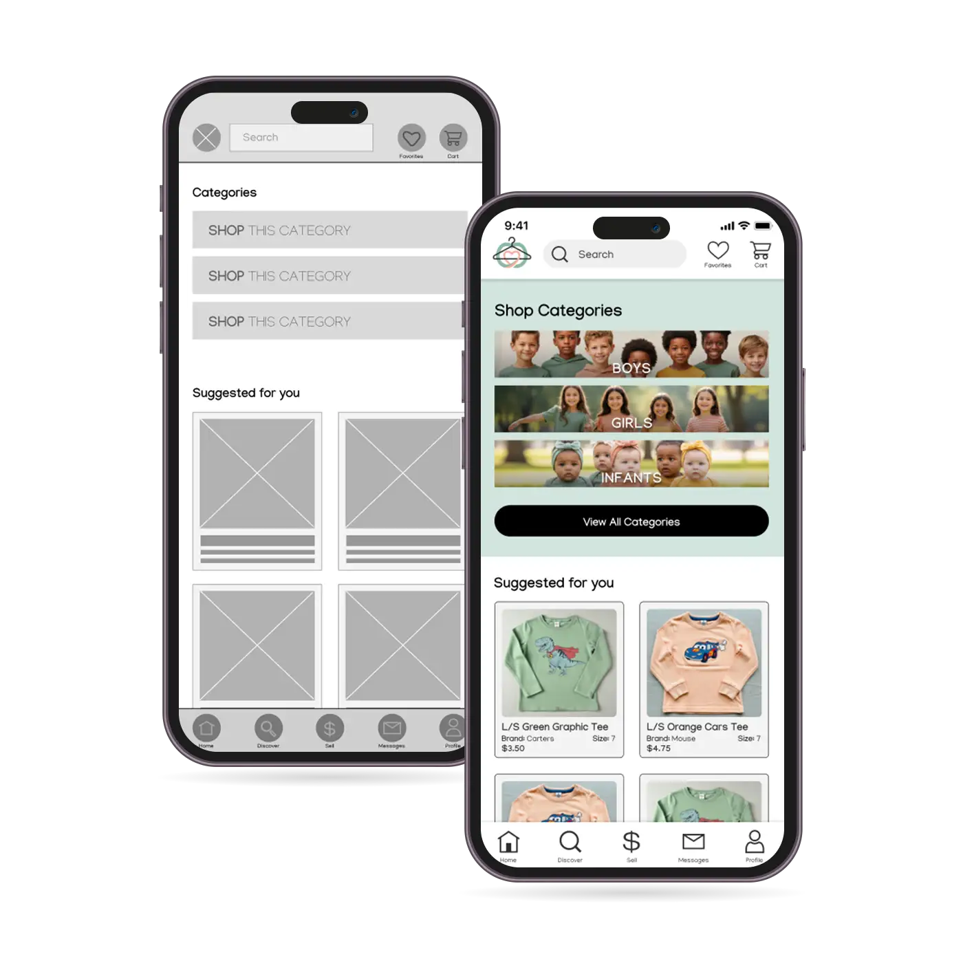
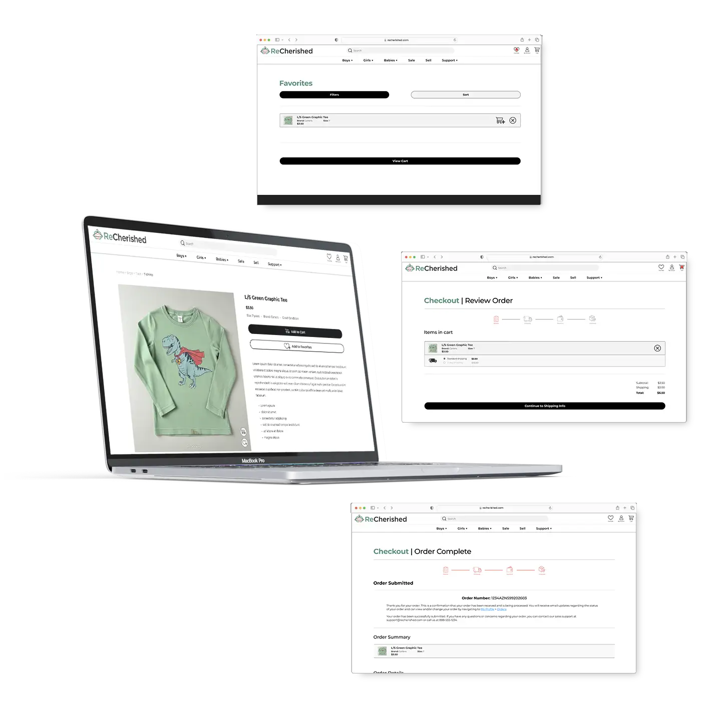
We conducted qualitative user research through interviews, persona development, and the creation of user stories and user journey maps to understand how different users buy and sell used children’s clothing online. We began with the assumption that most users preferred mobile apps, valued social features, and primarily desired low-cost options. After research, we found significant variation: many users prioritized trust, clear information, and efficiency over price; some, like Jason, strongly preferred desktop; and others, like Chloe and Diego, valued aesthetics and sustainability more than we expected. The research revealed shared pain points, including inconsistent item details, poor filtering, tedious/difficult process to list items, and unclear seller communication, shifting our assumptions toward the need for a flexible, trustworthy, multi-platform experience rather than a one-size-fits-all mobile solution.
Our user research revealed 4 major pain points of users: inconsistent item details, inefficient filters, unreliable seller communication, and difficulty listing items
100% of the users during the user research expressed inconsistent item details being a top pain point
Using the findings from the user research, I drafted paper wireframes with the pain points revealed in research in mind. The best elements of the drafts were selected and then combined into a digital wireframe in Figma. All designs were created in low-fidelity and minimal colors; just enough to provide the basic idea of what the finished product will look like. The digital wireframe was then extrapolated into different screens that I could use when running a usability study.
6 quick paper wireframe sketches were created to draw upon the best ideas
12 different page screens were created in digital low-fidelity in Figma
I conducted a usability study to understand if the core user experience, browsing for items and ordering desired items, was easy for users to complete. The study was designed as an unmoderated user study in which users were asked to perform tasks with the low-fidelity prototype on Figma. The task list was comprised of 4 prompts of a basic user path in which the user would start from the Home screen, browse for an item, add it to their “Favorites”, add the item to their cart, and then complete the checkout process. For each prompt, participants would document their click path as well as list any behaviors, opinions, and attitudes along with any errors, issues, or areas of confusion experienced. The study yielded valuable data from the participants in which patterns and themes were identified and converted into insights for the project. These actionable insights were further classified into priority levels and then applied to the low-fidelity prototype to create an updated version for further testing.
4 out of 5 participants of the usability study felt that the navigational elements that use icons or symbols need to be more clear
3 of 5 participants want to see clear visual confirmation when they perform actions in app, such as adding to Favorites or adding to cart
The data yielded by the usability study was parlayed into actionable insights. I created a checklist of items to address for a smoother user experience and made the changes accordingly and eventually developed a high-fidelity prototype from the results. The initial checkout process proved somewhat confusing or cumbersome to most users and was adjusted to be more congruent with user expectations as well as typical e-commerce user flows. Additionally, more (and better) visual confirmation was added to the experience to improve intuitiveness.
An additional high-fidelity mockup screen was created to help make the user flow feel more complete
5 out of 5 usability testing participants expressed that the updated experience was easy to understand and enjoyable
ReCherished was my first truly dedicated UX design project. I had a strong personal connection to this project, as I am a parent to a toddler and often feel the burden of procuring clothes for a constantly quickly growing daughter. This project was an excellent foray into the world of the product development life cycles, user research, digital prototypes, and usability studies.
My core takeaways:
- The importance of UX research — particularly in regards to empathizing with end users and the define phase of the design thinking framework
- Creating prototypes in Figma
- Planning and conducting a usability study