Designed for Mobile. Built to Win.

Web Design & Development

Most customers search on mobile first. A responsive, mobile-first website boosts SEO, loads faster, and converts more visitors. Without it, you’re losing visibility, traffic, and sales. Mobile-first web design isn’t optional—it’s the foundation for ranking higher, engaging users, and growing your business online.

Most customers start their searches on mobile, making mobile-first web design essential. A fast, responsive, and user-friendly site leaves a strong impression while Google rewards mobile-ready websites with higher rankings. Beyond SEO, mobile-first design drives engagement with clean layouts, intuitive navigation, and lightning-fast load times, reducing bounce rates and boosting conversions. Whether attracting leads, selling products, or showcasing services, mobile-first design aligns with user behavior, maximizes visibility, and future-proofs your brand.

A great website design isn’t just about how it looks; it’s about making intelligent, contextual decisions. These details shape the experience and make all the difference between a website that just exists and one that truly delivers.
Mejo Kuriachan, CEO, Everything Design
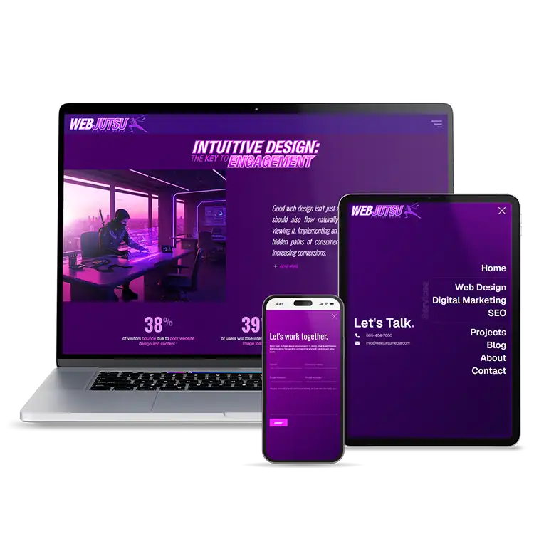
Built For Performance

Custom Website Solutions

Your business deserves more than a template; it needs a custom website built for performance, precision, and growth. As a seasoned web professional, I understand that great design isn’t just about visuals; it’s about speed, usability, and conversions. From clean code to intuitive user experiences, I craft every detail to align with your goals and engage your audience. With a tailored solution, your site loads faster, ranks higher, and scales seamlessly as you grow. Invest in a website that works as hard as you do.

94%
of first impressions relate to website design
54%
of e-commerce sites are rated as having mediocre or worse navigational design
47%
increase in users’ on-page time occurs when visual web content is present
Seamless + Responsive

Mobile-First Design

Mobile-first design is no longer optional; it’s how Google ranks your site. The search engine now indexes your mobile version first, meaning if it’s slow or poorly designed, your visibility drops on both mobile and desktop. With most users searching on phones, page speed, responsive layouts, and intuitive navigation are critical for engagement and conversions. Google even relaxed rules on pop-ups and collapsible menus, showing its priority is streamlined mobile usability. A mobile-first site ensures your brand stays competitive, future-ready, and discoverable—delivering seamless experiences across devices while boosting search rankings where it matters most: ON THE GO. I’ve been working in producing mobile-first web solutions since Google formally adopted their mobile-first indexing approach in 2018 – so, if anyone knows how to build you a mobile-first compliant website, it’s me!

Mobile-First Design
60%+
of global ecommerce sales come from mobile
40%
of revenue in leading B2B organizations is influenced by mobile devices
61%
of mobile searchers are more likely to contact a local business if they have a mobile-friendly website design
Seamless User Experiences

Intuitive Design

Great web design doesn’t just look good, it thinks like your users do. Pair it with smart analytics, and you uncover the hidden journeys behind every click, turning insights into conversions. As a hybrid designer/developer, I channel my unique skillset and instincts to build custom solutions for various needs. Furthermore, I have an analytical mind and a background in Interactive Design, allowing me to design interfaces and experiences with the end user in mind and then implement A/B testing and analytics to augment the code and design to create the optimal form.

60%
of users will abandon their cart if they’re buying on a website with poor user experience
38%
of visitors bounce due to poor website design and content
39%
of users will lose interest due to slow image loading