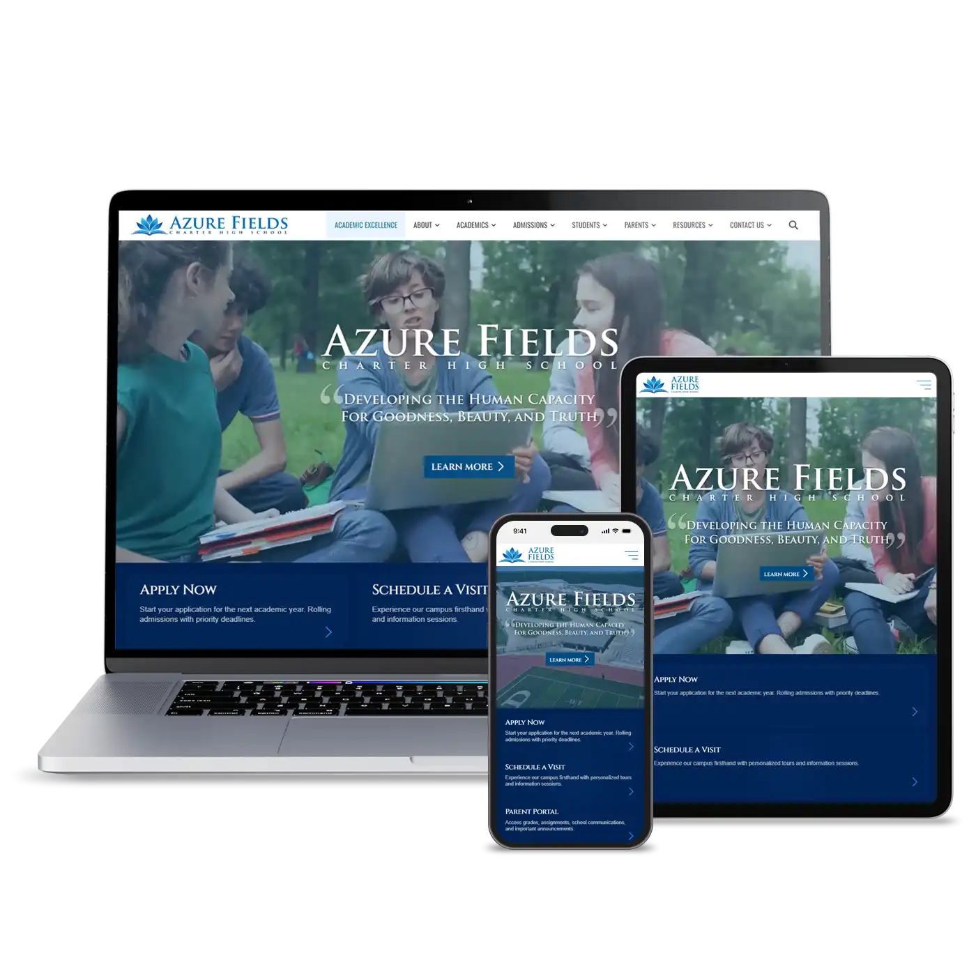
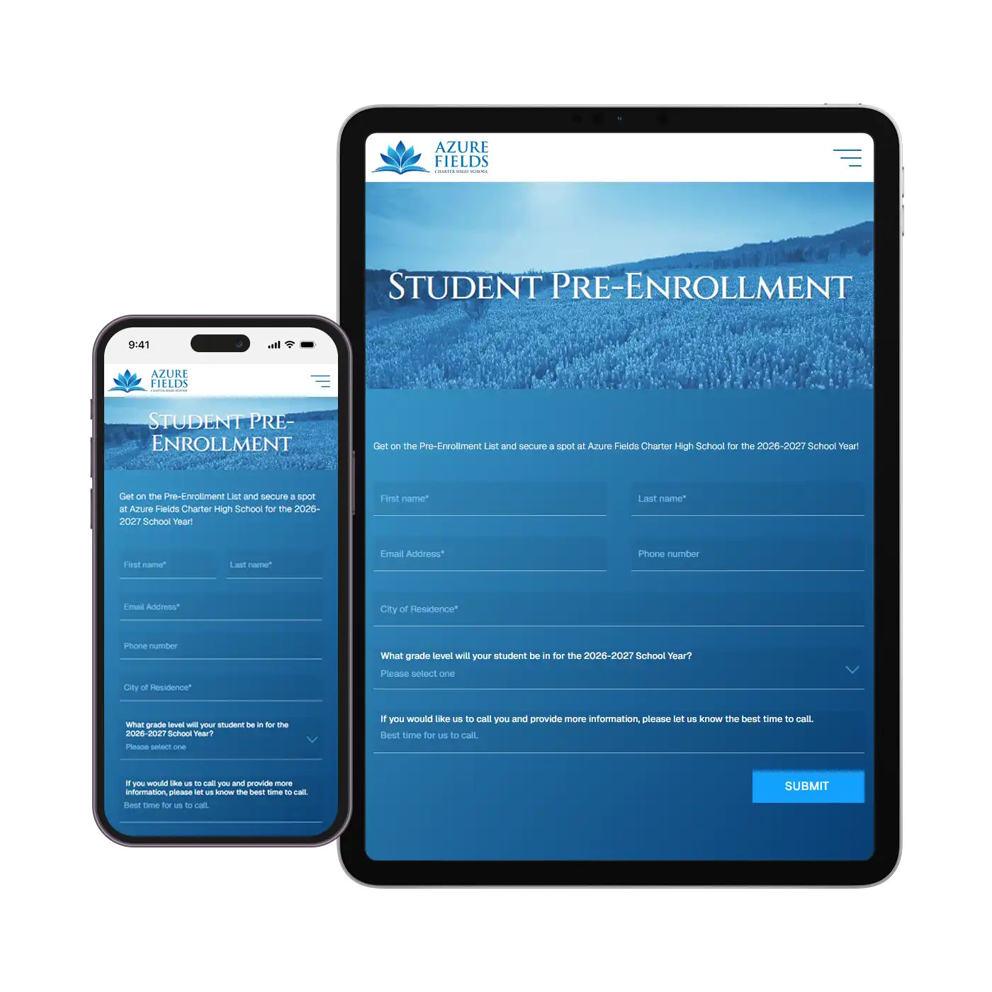
Website redesign and rebranding for a startup charter high school in Utah. The objective was to create a professional looking site that could convey the school’s Waldorf-style approach to education.
Charter School | +50 Employees
School | Secondary School
Lehi, UT