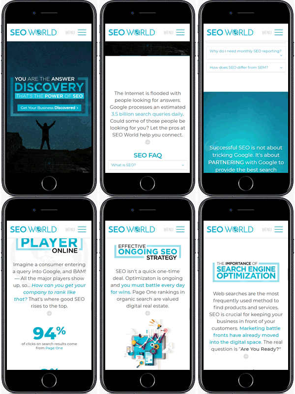
As the major search engines have begun shifting towards Mobile First Index and, statistically, mobile search has overtaken desktop, we need to begin tailoring the web user interface to intuitive mobile display while retaining the amount of copy necessary for Search Engine Optimization.
Why Mobile First?
Google only uses one index and today’s index is the same one that was already being used for organic search. The most recent updates merely changed how content is added to the existing index. It does not mean your desktop-heavy index will be lost; it does mean that mobile version factors like page speed, load time, ease of navigation, etc. will become increasingly important. In fact, your content copy is now more important than ever, as Google wants your copy to be relevant — remember, they’re trying to connect people with information. The question then becomes: How do we display the copy congruent to how users behave?

In order to design for mobile, we need to be cognizant of how mobile users behave — users skim, looking for the most pertinent information and moving on as quickly as possible. With attention span at an all time low, we need to help users find what they’re looking for and obscure the SEO copy that, while relevant, isn’t what users want.

Bridging The Gap
It’s all headlines and bulletpoints from here on out. We need to keep the SEO copy, so it has to stay. But what about the users? They don’t care about the nitty gritty details. We placed all SEO copy within spry-boxes that users could opt to open, but likely won’t. Their attention is a precious commodity that we can’t squander. With our prime real estate, we’ll place copy that is structured in a conversational human tone — headlines that speak to the core of the users, engaging their “why”. As often as we can, we’ll offer the statistics that support our information, citing sources when applicable. Our goal is not just to help users find what they want, but also to build trust with them.
We’ve creating a web experience that is intuitive and easy to navigate. The information that users want is in plain sight and is organized in a cogent and logical flow. A quick contact button is conveniently affixed to the page as the user scrolls down and each page concludes with a single call-to-action designed to evoke feelings of an experience that is not to be missed!
Closing Thoughts
As mobile devices have become ubiquitous, user habits have changed, and design needs to reflect the changing times. Studies have shown that user reading habits have been re-oriented to skimming. Many users have adopted an F or Z-pattern when reading in which they sample the first line and then word-spot through the rest of the text. In essence, users just want to cherry-pick only the information they deem useful and don’t care about the rest. This comes into direct conflict with how Google Search algorithms currently work — Google wants websites to contain “real” information, usually at lengthy amounts. In closing, as we design for the future, we need to stay aware of search engine trends as well as user trends. We have to create a compromise that gives users what they want, while catering to the demands of the almighty algorithms.
Project Features:
- Mobile-First Design / Responsive
- UI/UX Design
- Custom Shot Home Video background, optimized for load time
- Graphical statistics displayed using Chart.js
- Animated number statistics
- Lazy-load containers to reduce initial page load size
- Custom dynamically-driven main navigation
- Dynamically generated side navigation with section titles
- Custom shot background videos for calls-to action
- Portfolio + Case Studies
- Fixed floating CTA coded to change colors for user awareness
- CMS Integration
